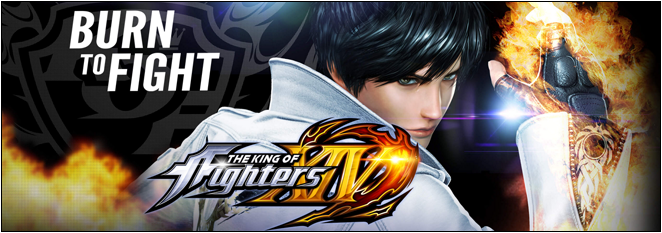
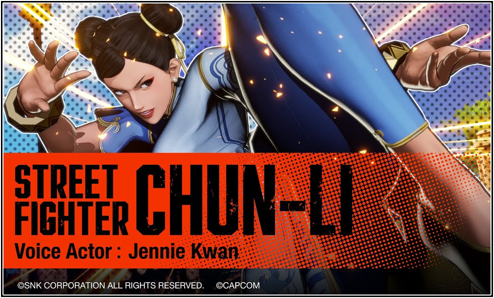
The King of Fighters XIII made us all marvel at how beautiful sprites could be in high definition, surpassing even the quality of Arc System Works’ BlazBlue series. I still remember reading in the past that SNK Playmore said that they would eventually be going the same route that the Street Fighter series had gone, and that is making 2.5D fighters (basically, 3D characters on a 2D plane), and it seems that day is finally upon us.
With the debut of the first “teaser trailer” for The King of Fighters XIV, I will be giving my impressions on SNK Playmore’s venture into the next generation by use of the same 2.5D style that Street Fighter and latest user Guilty Gear have made its way to. Go ahead and hit the jump to catch the full details.
[ Trailer and My Impressions ]
Initially I was very hyped when I read the tagline of the video “THE KING OF FIGHTERS XIV Teaser Trailer”, I knew this was going to be good! However, what awaited me was anything but. During this brief 40 second trailer I was left with my jaw dropping in horror from the pitiful display that was before me. If there was ever a time that I wanted to vomit in terror, this was that day.
Before I begin to talk about the myriad of things that are wrong with this trailer, I want to at least outlined the good things that I saw. The music is pretty all right, especially towards the very end of the trailer. The logo for The King of Fighters XIV actually looks pretty damn good, a step up from the logo art of The King of Fighters XIII. All right, now onto everything that happened to be WRONG with the trailer.
First off, let me talk about the presentation done for this. This is suppose to be a teaser trailer for the game, and that means we are supposed to be given just enough for us to eagerly anticipate what is going to happen when we get an official announcement trailer. What SNK Playmore delivered to us was a brief game play trailer which did not let us digest anything (more on the actual trailer content itself first) and did not leave anyone awe struck. Kyo and Iori are fighting it out and not much of anything outside of some normals, special moves, and combo starters. The first game play we saw of Street Fighter V lead to massive speculations and hype, and Guilty Gear Xrd -SIGN-‘s announcement trailer was highly impressive. What was their advertising department thinking when they did this?
As far as the graphics goes, I am not quite sure what we are seeing here. They actually could be good or bad, we have not seen enough to really make a firm decision based on what was presented here. However, the vast majority I have seen believe that the graphics are terrible and that the animation looks rather clunky and unpolished, which it could be if it was still within the alpha stages of development (but if it is, why would they even bother to show this?). The overall look seems uninspired and completely generic and bland. Going from beautifully rendered 2D sprites to this cookie cutter 3D graphics feels lazy and uninspired. To be quite honest, I thought this had to be a joke initially.
SNK Playmore has worked on other fighting games that were 2.5D, such as KOF Maximum Impact series and Fatal Fury: Wild Ambition, so I thought they would learn by now what is and what is not acceptable. I really cannot say too much more about this trailer other than it is awful, terrible, and that they need to go back to the drawing board if this is the best that they have to offer. If they are not ready to step into the realm of 3D, they should stick with 2D since they have perfected that art. This is an abomination waiting to happen.


Leave a Reply!