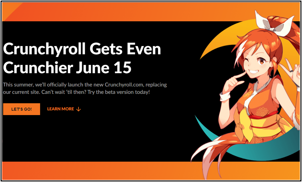
When going to Crunchyroll to watch anime, as I have scheduled it within my list of day-to-day activities as it’s a passion of mine and a necessity of this website, I checked out a post they made on May 17th (Which you can check out here).
“Crunchyroll is announcing today that as of June 15, all registered users in the United States will be in the new website experience by default. But don’t worry! All of your watchlist and profile information will be retained, and you will not have to take any actions on June 15. However, registered U.S. users will not be able to access the old website unless they are logged out“.
— Crunchyroll Website
The first thing that stood out to me was forcing this UI (User Interface) on users who pay for their subscription and not those who use the site without one. Next I was worried because of various users who apparently opted into the beta experience and were not happy with the changes that Crunchyroll made; the most notable being that this was not made with the anime community in mind and was a “copy-and-paste” of Netflix’s UI. Here’s a screenshot of the first 5 comments after the post ends.

Despite how bad this appears to be, you don’t really know until you try it, so that’s exactly what I was going to do. Was this really a cause for concern and warranting of the outcry I’ve been seeing? Needed to see for myself what will happen to the website on June 15th.
NOTEI primarily watch Crunchyroll on my computer, and I do that through Google Chrome. I am unable to properly judge user experiences using a different browser and any related issues caused by doing so.

The very first thing that I noticed (and hated) when switching over to the beta was the “Avatar Selection” that came up. Unlike their previous UI which allowed me to upload a picture of my choosing, I had to choose from various pre-made avatars which takes away from the individuality I enjoyed on their original interface. This is why the very first comment of the screenshot I showed you from users who disagreed with Crunchyroll’s decision said, “Goodbye beloved avatars”. This is one of the main reasons I barely use their other website, VRV.co, because it does not have that function. Already to safe to say that this beta is off to a bad start.
Also, your individual profile is vastly different. You don’t have information presently available for everyone to see, such as your favorite anime, music, games, books, etc. No “About Me” section to type or “Groups”; just bland and lifeless. You cannot even click on avatars to go to user’s profile from their comments on videos. This is probably the worse thing I’ve seen so far.
Though, the entire site being in “Night Mode” is fine for me, considering I always put my website on this anyway (and technically this website has a darker theme as well). So while some people wanted to turn it off, this was not a negative at all for me. However, you should give user’s the ability to swap do a lighter theme if it was available before on the older UI for those that prefer it.
ORGANIZATION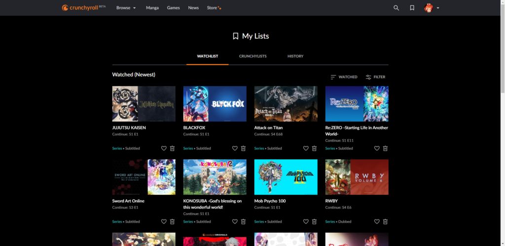
I actually liked this UI more than the last one when it came to how things are organized. The previous interface only had “Queue” and “Watch History”, the new UI features “Watchlist” (same as Queue), “Crunchylists”, and “History” (same as the previous UI). While it may seem the only addition is Crunchylists, I actually like how these are presented better.
The Watchlist displays anime you’ve favorited in the order you’ve most recently watched them. I also like how it’s 4 anime per row instead 1 anime, making it so much easier to see everything within your queue without a ton of scrolling.
History is more-or-less the same as it always was, but has the benefit of bigger thumbnails which allows a better look. History at some point also moved to 4 anime per row, but this is within the original UI as well.
The most important thing on here is the “Crunchylists”, which I feel is something I can use quite a lot. Crunchylists allows the user to create customized anime lists with up to 100 items each. So if you need to keep track of current anime for this season, add something to a back-up queue, or are recommended something from friends, you can keep everything separate. For someone like me who needs organization and hate everything being piled into one area, this is worth switching to the new beta UI alone for.
FINDING ANIME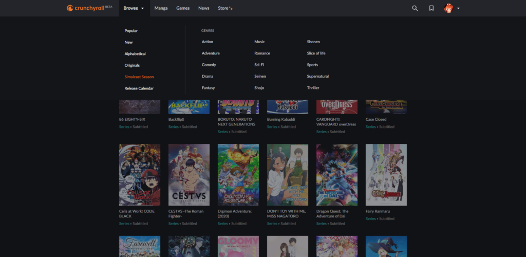
Some of the comments made me believe a lot changed for the worse; finding anime, free-flowing comment sections, and overall ease-of-use. However, as you can see, I had no problem finding anything. They had anime organized into Popular, New, Alphabetical Order, Originals, Simulcast Season, and a Release Calendar. They also have all anime separated within categories (15 of them at that). With this being said, I have no idea how anyone has issues when it comes to finding anime.
Something else that bothered me was the whole “free-flowing” comments part. The comment-section looks more-or-less the same as they already did; people freely posting whatever they want and giving the ability for anyone to reply to them or make their own standalone comment. I like it even more because replies to comments are already hidden and if I want to see them, I just unhide them. By default they are mostly posted under each comment and you have to hide them, making it harder to find individual comments you may want to respond to or read the replies of.
UNCHANGING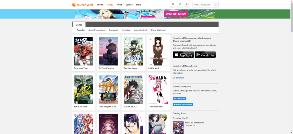
Despite us moving to this new UI, some sections link back to the original site’s design. The sections I’ve found that do this are Manga, News, Games, and Store. So while this design is being forced on those who may not want it, it’s not really a complete redesign that encompasses everything that Crunchyroll has to offer. This experience is really only affecting those who watch anime, and right now it’s specifically only those that pay for the service (as the official post stated you would see the old site only if you’re logged out after June 15th).
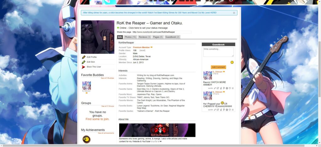
I have been using Crunchyroll since 2013, and have used it to watch various anime. While I love to use the website to view shows, I am also not what I would consider a “Hardcore” user of some of its features like forums or groups. I rarely comment on videos or view others profiles, so I am only really seeing the positives of the new User Interface. While I 100% hate not being able to use my own profile picture and banner, it’s not like it’s changing my main goal of watching anime.
However, the comments have shown me that many people have their reserves when it comes to the June 15th update; broken websites on browsers, the possibility of losing forums, individuality being loss due to profile customization and other things they’ve come to enjoy. While it could be that the main ones who chose to comment are those who want things to stay the same, you’d generally see a large variety of people arguing both for and against. Even though I don’t have a problem with this change aside from personalization of my avatar and page, the comments themselves are overwhelmingly negative and should be a cause of concern.
I feel Crunchyroll needs to make a post that addresses some of the bigger issues. They need to explain why you can no longer use a customized avatar, address the fear that forums are going away, and take suggestions on how to better efficiently use the UI so that it feels more akin to making Crunchyroll a customized experience rather than a forced one.
 (No Ratings Yet)


Leave a Reply!